Lire cette étude de cas en français →

Case study / ECAB · SI-Bat

Tools for work.
For everyday life.

Making information easier to access, without losing the detail people need.

I helped design SIBat for ECAB, an online portal and mapping tool for buildings in the canton of Fribourg. My role: understand how teams work, organise information and design screens with the people who would use them.

Context
ECAB — the canton of Fribourg’s building insurance institution
My contribution
Understanding needs, designing user journeys and preparing for delivery
People involved
Internal teams, field professionals and partners during 2 years

01 / Context

A need to modernise.
Different needs to bring together.

ECAB insures buildings in the canton of Fribourg and supports the prevention of fire and natural hazard risks. Within this context, SI-Bat aimed to bring together insurance, technical management and risk prevention information for each building.

Staff, partners and policyholders do not approach a building with the same needs. Some prepare inspections or manage several properties; others need access to documents and information about their building.

The vision for the portal: bring this information into one tool, with access tailored to the different user profiles identified through personas.

My contribution to the team

Understand, design
and connect the dots.

I worked with business and technical teams, from understanding work in the field to defining features for delivery.

  1. 01

    Understand everyday work

    Gather needs, observe professionals in the field and analyse the steps involved in their work.

  2. 02

    Design and test user journeys

    Move from early sketches to detailed screens, then to prototypes people can test.

  3. 03

    Prepare for delivery

    Describe the expected functionality and contribute to shared interface components to support the technical team.

A closer look: methods and skills

My work combined UX Design, Product Design and, where needed, Product Ownership and Business Analysis.

  • Research and discovery: gathering needs, shadowing people at work, analysing business processes and field workflows.
  • Design: in-app journeys, low- and high-fidelity mockups, prototypes and contributions to the design system.
  • Delivery: documenting functional requirements and writing user stories.

This was a multidisciplinary team effort: the choices presented here are not attributed solely to my work.

User testing · February 2021

Reporting an issue
from a phone.

A practical task: record a compliance issue during a building inspection, with a photo and description.

I co-presented the mobile prototype to domain experts before they tested it remotely. The test highlighted areas to examine in the available actions, readability and navigation.

For this first task, 7 out of 10 participants completed the journey successfully. Beyond completion rates, the test also helped us understand where people struggled.

A mobile interface example

Making connection status visible.

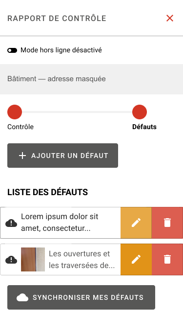
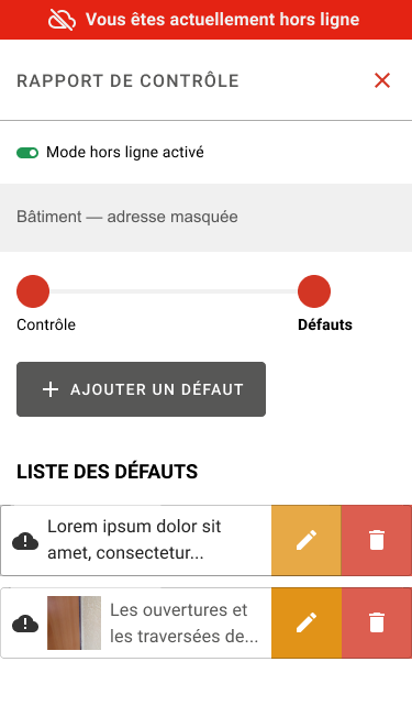
Two states of the inspection report: a message and indicator signal offline mode; a synchronisation action appears in the connected view. These screenshots illustrate the interface, rather than a before-and-after comparison of the tests. The original interface is in French.

French inspection report with offline mode disabled and a button to synchronise recorded issues.
Connected mode
Recorded issues and a synchronisation action.
French inspection report with a banner stating that the user is offline and an enabled offline-mode indicator.
Offline mode
A clear banner indicates the lack of connection.

Screenshots cropped and address redacted. Select an image to view it on its own.

What the tests helped us examine

Finding

Adding a second compliance issue raised questions about the visibility of the button.

Recommendation

Make the add action more prominent in the screen hierarchy.

Finding

Text size in the data-entry journey needed checking.

Recommendation

Assess readability on the phones used in the field.

Finding

Returning to the building record was difficult to assess: some controls did not work in the prototype.

Recommendation

Complete the prototype interactions and warn users before closing without saving.

The recommendations from the prototype test were implemented.

Read about the test protocol and its limitations

Mobile test in February 2021

Following a demonstration, experts tested the Figma prototype remotely through Maze. Five tasks covered reporting an issue with a photo and text, adding a second issue, generating a report, completing an inspection with no issues and returning to the building record.

Participant numbers varied between tasks. The prior demonstration and some non-functional prototype interactions should be considered when interpreting the results. These tests covered the mobile inspection journey, not the November navigation proposals shown on this page.

First impressions of the tool in March 2021

A session presented by other team members involved two groups of ten future specialists, one French-speaking and one German-speaking. AttrakDiff and an open-ended questionnaire complemented the evaluation.

Feedback highlighted a hard-to-find search function, filter categories that needed updating and tools that were difficult to locate on tablets. These findings provide a complementary perspective.
Product vision · November 2021

Three choices to
focus on what matters.

The needs we identified guided the organisation of information and journeys in the application. Here are three proposed design choices and the needs they address.

01

Tailor navigation to each role

The same navigation does not necessarily address every user profile’s priorities.

The proposal Tailored entry points within the building record, with a filterable history limited to documents the profile can access.

The aim: keep relevant information close at hand without losing access to historical records.

02

Keep the building in view

The record provides access to several areas and many documents.

The proposal Keep a map and address in the header while navigating between sections.

The aim: keep the building being viewed visible, even when the user moves to another topic.

03

Adapt the starting point

Looking up one building and managing several call for different starting views.

The proposal Open the building record directly for policyholders with one building; offer a dashboard to those with several.

The aim: prioritise direct access in the first case and an overview in the second.

One portal, two proposed starting points
One buildingDirect access to its record

View information about the property.

Several buildingsDashboard

Get an overview.

An explanatory diagram of the product vision, not a screenshot of a delivered interface.

Another aspect of my role: business discovery in 2022

For the building systems workstream, I was identified as Product Owner and UX Designer. The kickoff plan assigned me to facilitate a process-mapping workshop (service blueprint) and participate in feature prioritisation (story mapping).

The aim was to understand existing processes before defining features and organising the team. These were the responsibilities planned at kickoff; this section is not a delivery report.

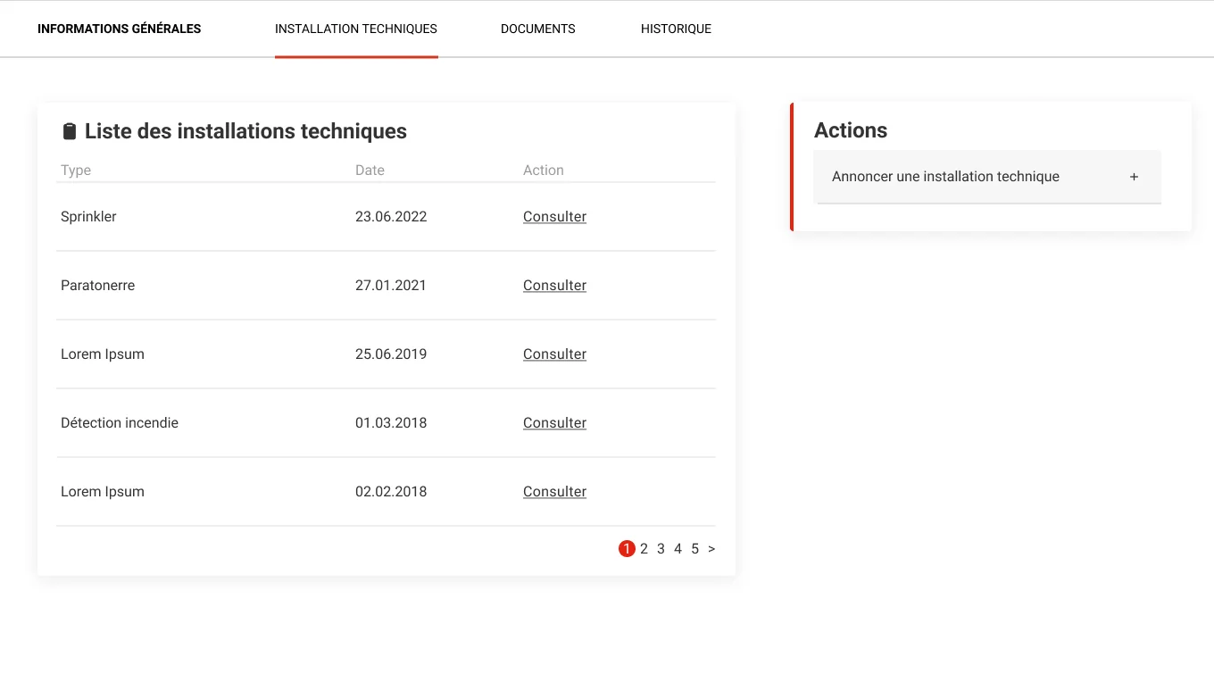
French building systems interface listing equipment with view links and an action to register a building system.
Design view: browse a building’s equipment and access the registration action. The screenshot focuses on the equipment list; the map, address and side navigation have been cropped out.

How I work

Design with teams.
Support their autonomy.

Observe real work, make proposals tangible and explain the process: an approach I also share in my presentation “The holy user experience”. The aim is to give teams the understanding they need to take part in decisions, not simply hand over screens.

SIBat project for ECAB. Screenshots have been cropped and addresses removed or redacted to avoid exposing building-specific information.

What about your team?

Complex processes.
Everyday tasks to simplify?

I help you understand how people work, clarify priorities and design tools that fit their day-to-day needs.

Let’s talk about your needs